My projects usually involve adapting, modifying, manipulating and, occasionally, torturing data. It is an addictive love-hate relationship that eventually bears fruit in the form of maps, graphs, infographics, and documents. This is my contribution to making the world more understandable… or at least I hope.
REC data booklet
2022
Tools: InDesign, Illustrator, R
This booklet is a guide for researchers to work with the database at REC (Research Centre for Ecological Change).
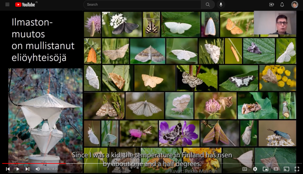
I made a short video to explain what REC is and why our work is so important for the environment… and your breakfast
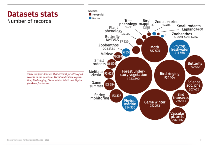
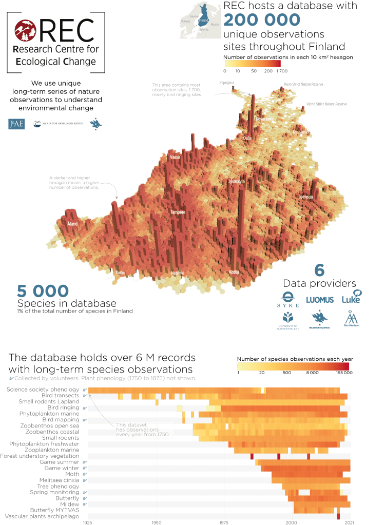
REC infographic
2022
Tools: R, Illustrator, Photoshop, QGIS
The REC database is a collection of datasets containing long-term species observations in Finland for the exclusive use of REC researchers.
I wanted to design an infographic to provide an overview of the database.
Policy advice
2021
Tools: InDesign, Illustrator
I designed the layout of this policy brief for the Research Centre for Ecological Change (REC), which encourages policymakers to adopt actions for the Finnish Nature Conservation Act.
The challenge was to make it short, readable, and visually attractive. I used a two-column layout with images, graphs, and quotes to make the text less heavy. I thought a blue-red-orange palette would go well with the logo and graphs. I used bold font for important sentences to make them stand out and easier to skim.
#RECordYourScience
2021
Tools: Premiere Pro
I coordinated, organized and edited a series of videos that aimed to make science more accessible.
Researchers at REC (Research Centre for Ecological Change) briefly discussed their groundbreaking research.
StudyingBiodiversity.com
2020
Tool: WordPress
This educational website was designed to teach schoolchildren and the general public about biodiversity and environmental change. I coordinated the design, implementation, and translations to different languages. The amazing content was written by my colleagues and the beautiful site was designed and built by an external designer.

HELCOM Maritime Assessment
2018
Tools: InDesign, Illustrator, ArcGIS, R
The assessment of the maritime activities on the Baltic Sea is published periodically, but this was the first time we made an extra effort to make it more visually appealing.
We spent months sketching and designing maps, graphs and diagrams for each chapter. The result is quite nice, if we may say so ourselves. I like especially the visual index. We explained how we did it in a seminar.

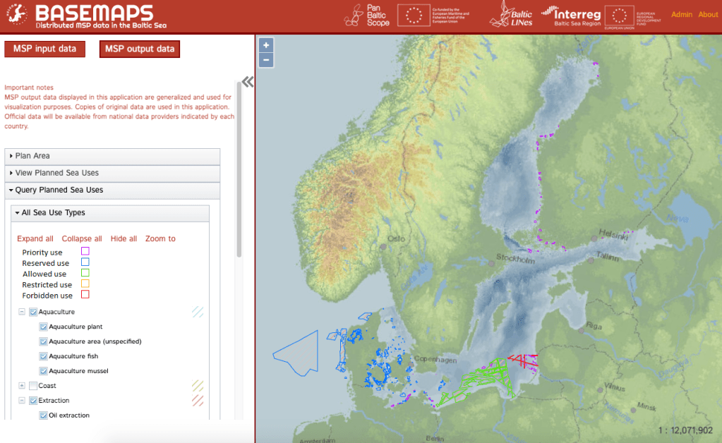
Basemaps
2019
Tools: InDesign, Illustrator, ArcGIS, R
The project BalticLines (2016-2019) was a lot of fun. I managed a Work Package to design and implement a service to access decentralized Maritime Spatial Planning data.
I also produced:
– A video animation to tell the story of the project.
– An album with pictures of meetings, and visuals.
– An infographic.
– A flyer to share at conferences.
– Visual instructions to use the service.
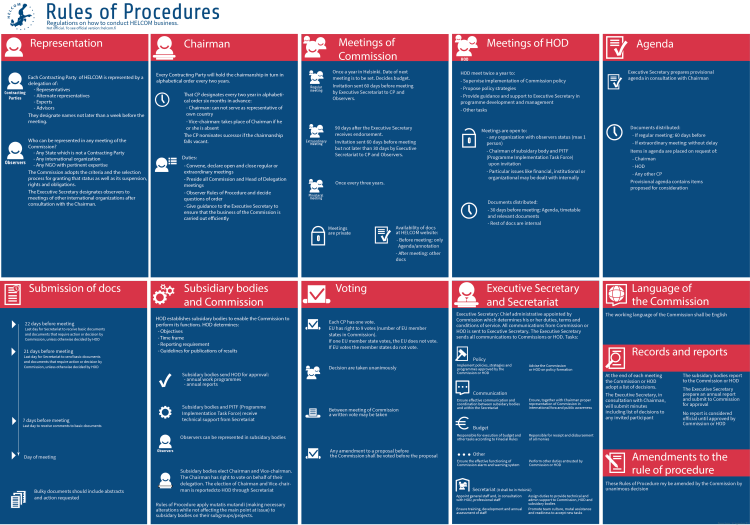
HELCOM rules of procedure
2019
Tools: Illustrator
The rules of procedure are the regulations that govern the way a legislative body conducts its business. They provide a kind of instructions on how HELCOM must be conducted.
When I first read them, I found them overly complicated so I decided to make them more visually appealing. While they remain legal text, I hope that the visual aids make them easier and more enjoyable to read.
EBSAs in the Baltic Sea
2018
Tools: ArcGIS, Illustrator
I designed a visualization in ArcGIS StoryMaps to highlight the importance of each Ecologically or Biologically Significant Marine Area (EBSA) in the Baltic Sea.
The maps are complemented by well-designed icons, graphs, and pictures to reinforce the story.

A sea with many flags
2018
Tools: ArcGIS, Photoshop
I made this just for fun. I thought it would be interesting to see under which flags ships sail the Baltic Sea in a certain year. No less than 82! Some of them are as exotic as Kiribati or Tuvalu (island countries in Oceania).

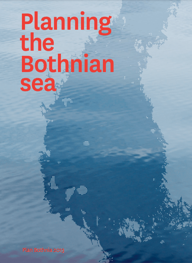
Plan Bothnia
2012
This was a project about Maritime Spatial Planning led by us at HELCOM. We commissioned the design of the final report to Nieminen&Siitonen. It won several design awards, for example, Grafia’s “Best book of the year”.